Most product pages sell the product. Fewer of them sell the full picture.
Customers land on a product detail page (PDP), see the hero image, scan the price, and then pause. Not because they are on the fence about the product itself, but because they are not entirely sure what comes with it.
That moment of doubt is quiet. It rarely shows up in your analytics. But it shows up in your conversion rate.
We decided to find out how much it was costing some of the brands we work with.
The hypothesis
Clearly displaying what is included in a purchase on the product page would reduce purchase hesitation and increase buyer confidence. More clarity at the point of decision equals more conversions.
The test setup
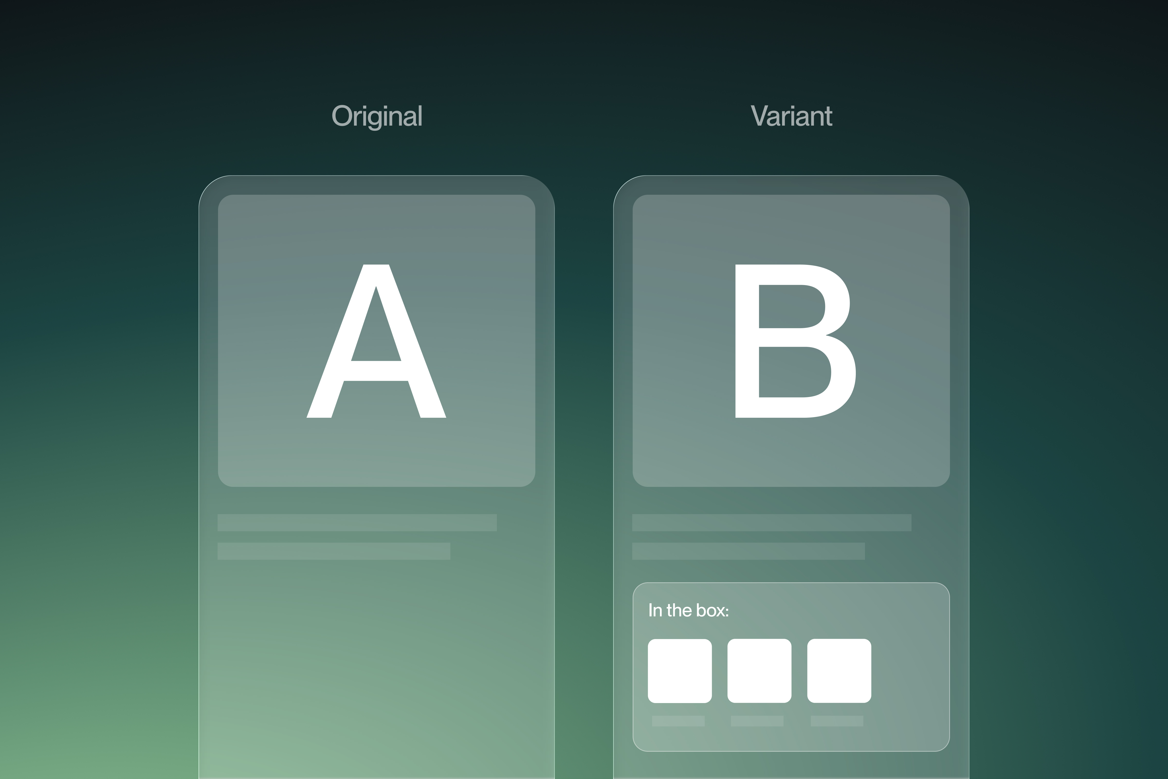
- Control: Standard product detail page
- Variant: PDP with a visual "What's Included" section
- Primary metric: Conversion rate
- Sample size: 12,412 visitors
- Duration: 13 days
The result
One section. Meaningful numbers.
- +30.5% increase in conversion rate
- +41.5% increase in revenue per visitor
- +15.9% lift in average order value
What the data actually told us
1. Unanswered questions are silent conversion killers
When shoppers are unsure what is in the package, they go looking for the answer. That search takes them off your page and rarely brings them back. Answering the question before it is asked kept shoppers in the funnel at the exact moment they were ready to act.
2. Clarity and value are not the same thing, but they move together
The AOV increase was the surprise. A cleaner information experience did not just help more people buy, it influenced how much they spent. When customers can see the full scope of what they are purchasing, the product feels more substantial. That perception has a dollar value attached to it.
3. The mobile gap is real and closeable
Mobile drove roughly 87% of traffic and delivered the biggest gains: a 35.4% conversion lift and 43.3% more revenue per visitor. Mobile shoppers are less patient and have fewer open tabs. They will not go hunting for product details. If the information is not on the page, for most of them, it simply does not exist.
What this means for Shopify merchants
Product clarity is not a content problem. It is a revenue problem.
A well-executed "What's Included" section removes a friction point that most merchants do not even know they have. It does not require a redesign or a new app. It requires a decision to treat buyer uncertainty as something worth solving on the page.
The practical takeaways
- Prioritise this for products that ship with multiple components, where the full package value is not obvious
- Build the section for mobile first, that is where the return on it is highest
- Think about this as a conversion tool, not just a UX improvement
- Track revenue per visitor alongside conversion rate to get the full picture
- For simpler single-item products, weigh up the benefit against the additional page length
Where would we take this next
One result opens up several questions worth testing:
- Does the position of the section on the page change its impact?
- Does adding context around each component, not just listing them, push AOV further?
- How does performance differ across product categories and price points?
Our conclusion
Customers are not converting because they need more persuasion. Often, they just need more information, delivered at the right moment.
A single section on a product page answered a question shoppers did not know they could ask. The conversion rate responded accordingly.